Code
library(DT)

lewis_liked_tracks %>%
  dplyr::select(track.name, primary_artist, danceability, acousticness, speechiness, energy, valence) %>%
datatable()Master of Environmental Data Science @ The Bren School of Environmental Science at UCSB
March 12, 2022
Have you ever wondered how your music taste compares to your friends’? Or perhaps you’re just curious about how your favorite songs and artists and genres stack up against your peers. As a music lover, I enjoy discussing these topics and was thrilled when an assignment for my machine learning course involved analyzing Spotify data. For the assignment, my friend Elke and I shared our library of liked songs on Spotify so we could visualize comparisons between our music tastes and then create a model to try and predict whose library a song is in.
This blog post will have the following sections:
Visualizing Spotify Data
Statistical Tests: Prelude to Formal Classification
Summarizing the classification models
Comparing model performance
Final thoughts
Now, let’s dive into the fascinating world of music data analysis and discover whose song it is anyway!
Before getting started with the modeling, I wanted to explore the patterns of our data visually. Looking at the variables I was able to pull in from the API, I found the following particularly interesting:
Accousticness (0–1): Whether the track primarily uses instruments that produce sound through acoustic means as opposed to electric or electronic means.
Danceability (0–1): The ease with which someone can dance to a song based on a combination of musical elements like tempo, rhythm stability, beat strength, and overall regularity.
Energy (0–1): Represents a perceptual measure of intensity and activity. Song features that determine the energy score include dynamic range, perceived loudness, timbre, onset rate, and general entropy.
Speechiness (0–1): Speechiness detects the presence of spoken words in a track.
Valence (0–1): Describes whether a song’s vibe is positive or negative—tracks with high valence sound more positive (e.g. happy/cheerful), while tracks with low valence sound more negative (e.g. sad/angry).
To explore which songs in my library have particularly high/low scores for the above metrics, I created an interactive table (and learned that my taste in music is fairly chaotic!).
After exploring the songs in my library, I transitioned my focus to comparing my music to Elke’s.
#Danceability comparison
dance_plot <- ggplot(all_tracks, aes(x = danceability, fill = listener,
                    text = paste(listener))) +
  geom_density(alpha=0.6, color=NA) +
  scale_fill_manual(values=c("#b0484f", "#4436d9"))+
  labs(x="Danceability", y="Density") +
  guides(fill=guide_legend(title="Listener"))+
  theme_minimal() +
  ggtitle("Distribution of Danceability Data")


#speechiness comparison
speech_plot <- ggplot(all_tracks, aes(x = speechiness, fill = listener,
                    text = paste(listener))) +
  geom_density(alpha=0.6, color=NA) +
  scale_fill_manual(values=c("#b0484f", "#4436d9"))+
  labs(x="Speechiness", y="Density") +
  guides(fill=guide_legend(title="Listener"))+
  theme_minimal() +
  ggtitle("Distribution of Speechiness Data")


#acousticness comparison
acoustic_plot <- ggplot(all_tracks, aes(x = acousticness, fill = listener,
                    text = paste(listener))) +
  geom_density(alpha=0.6, color=NA) +
  scale_fill_manual(values=c("#b0484f", "#4436d9"))+
  labs(x="Acousticness", y="Density") +
  guides(fill=guide_legend(title="Listener"))+
  theme_minimal() +
  ggtitle("Distribution of Acousticness Data")

#energy comparison
energy_plot <- ggplot(all_tracks, aes(x = energy, fill = listener,
                    text = paste(listener))) +
  geom_density(alpha=0.6, color=NA) +
  scale_fill_manual(values=c("#b0484f", "#4436d9"))+
  labs(x="Energy", y="Density") +
  guides(fill=guide_legend(title="Listener"))+
  theme_minimal() +
  ggtitle("Distribution of Energy Data")

ggarrange(dance_plot, speech_plot, acoustic_plot, energy_plot, ncol=2, nrow=2, common.legend = TRUE, legend="bottom")
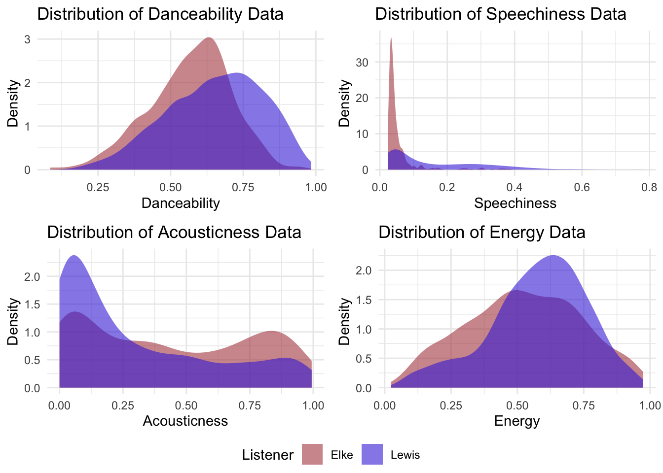
A few main takeaways:
Both Elke and I tend to listen to fairly danceable music, but my library includes more songs that are rated as highly danceable.
My library scored much higher in “speechiness” overall — I primarily listen to a mixture of rap and “sad girl” music, so I wasn’t surprised that my library contained more songs with spoken words than Elke’s.
The energy in our songs is quite similar, but my library scored a little higher here.
While both of our libraries spanned the full range of acousticness, Elke’s library had more highly acoustic songs while I had more that score very low on this metric.
#plotting valence and energy to get a sense for the moods of our liked songs
ggplot(data = all_tracks, aes(x = valence, y = energy, color = listener)) +
  geom_point(alpha = 0.5) +
  geom_vline(xintercept = 0.5) +
  geom_hline(yintercept = 0.5) +
  scale_x_continuous(expand = c(0, 0), limits = c(0, 1)) +
  scale_y_continuous(expand = c(0, 0), limits = c(0, 1)) +
  annotate('text', 0.25 / 2, 0.95, label = "Turbulent/Angry", fontface =
             "bold") +
  annotate('text', 1.75 / 2, 0.95, label = "Happy/Joyful", fontface = "bold") +
  annotate('text', 1.75 / 2, 0.05, label = "Chill/Peaceful", fontface =
             "bold") +
  annotate('text', 0.25 / 2, 0.05, label = "Sad/Depressing", fontface =
             "bold") +
  theme_minimal() +
  labs(x = "Valence",
       y = "Energy",
       title = "Plotting songs based on their positivity and energy level",
       subtitle = "Elke and I don't have many songs in the Chill/Peaceful quadrant.")
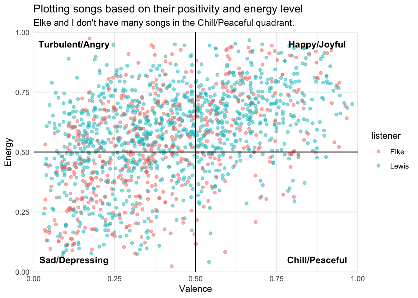
This above visualization compares the energy and valence of songs. To interpret the plot, it’s important to think about how energy and valence interact.
Low Energy + Low Valence = Sad / Depressing
Low Energy + High Valence = Chill / Peaceful
High Energy + High Valence = Happy / Upbeat
High Energy + Low Valence = Turbulent / Angry
Based on the plot, it looks like neither Elke nor I listen to much chill/peaceful music (which I found somewhat ironic as my most popular playlist on spotify is called “chill”). Aside from this, our music seems to span the graph fairly evenly, although we both listen to music that tends to be a little higher energy.
To see which songs represent the various points on this graph, check out an interactive version of the plot below.
## this plotly allows you to hover over points to see the track and the corresponding artist
plot_ly(data = all_tracks,
        x = ~valence,
        y = ~energy,
        color = ~listener,
        colors = c("#D1999C", "#9C8CEC"),
        type = "scatter",
        mode = "markers",
        text = paste("Track Name:", all_tracks$track.name, "<br>",
                     "Primary Artist:", all_tracks$primary_artist, "<br>",
                     "Valence:", all_tracks$valence, "<br>",
                     "Energy:", all_tracks$energy, "<br>",
                     "Listener:", all_tracks$listener)) %>%
  layout(xaxis = list(title = "Valence"),
         yaxis = list(title = "Energy"),
         hovermode = "closest",
title = "Track Valence vs Energy")To get an initial sense for whether my classification algorithms might be successful, I decided to run a few t-tests on my variables of interest to see whether my library is different from Elke’s on a statistical level. As can be seen from the tables below, all results were significant at the 0.001 alpha level, suggesting that prediction should be at least somewhat successful.
library(sjPlot)

dance_test_table <- tab_model(t.test(lewis_liked_tracks$danceability, elke_liked_tracks$danceability, var.equal = FALSE),
          string.ci = c("Conf. Int (95%)"),
          string.p = "P-value",
          dv.labels = c("Danceability Score"),
          pred.labels = "Lewis – Elke",
          title = "Table 1: Comparing Danceability Scores: Welch Two Sample t-test")

dance_test_table| Danceability Score | |||
| estimate | Conf. Int (95%) | P-value | Predictors |
| 0.09 | 0.07 – 0.10 | <0.001 | Lewis – Elke |
speech_test_table <- tab_model(t.test(lewis_liked_tracks$speechiness, elke_liked_tracks$speechiness, var.equal = FALSE),
          string.ci = c("Conf. Int (95%)"),
          string.p = "P-value",
          dv.labels = c("Speechiness Score"),
          pred.labels = "Lewis – Elke",
          title = "Table 2: Comparing Speechiness Scores: Welch Two Sample t-test")

speech_test_table| Speechiness Score | |||
| estimate | Conf. Int (95%) | P-value | Predictors |
| 0.10 | 0.09 – 0.11 | <0.001 | Lewis – Elke |
acoustic_test_table <- tab_model(t.test(lewis_liked_tracks$acousticness, elke_liked_tracks$acousticness, var.equal = FALSE),
          string.ci = c("Conf. Int (95%)"),
          string.p = "P-value",
          dv.labels = c("Acousticness Score"),
          pred.labels = "Lewis – Elke",
          title = "Table 2: Comparing Acousticness Scores: Welch Two Sample t-test")

acoustic_test_table| Acousticness Score | |||
| estimate | Conf. Int (95%) | P-value | Predictors |
| -0.13 | -0.16 – -0.09 | <0.001 | Lewis – Elke |
energy_test_table <- tab_model(t.test(lewis_liked_tracks$energy, elke_liked_tracks$energy, var.equal = FALSE),
          string.ci = c("Conf. Int (95%)"),
          string.p = "P-value",
          dv.labels = c("Energy Score"),
          pred.labels = "Lewis – Elke",
          title = "Table 2: Comparing Energy Scores: Welch Two Sample t-test")

energy_test_table| Energy Score | |||
| estimate | Conf. Int (95%) | P-value | Predictors |
| 0.05 | 0.03 – 0.07 | <0.001 | Lewis – Elke |
For this assignment, we were asked to try a number of different classification methods and compare their results. Here, I used the following methods:
K-Nearest Neighbors (KNN)
Decision Tree
Bagged Decision Trees (Bagging)
Random Forests
When analyzing the performance of a classification model, it’s important to take class imbalance into consideration. On this occasion, 68% of the songs used in the model belong to my Spotify library, so a model that simply predicts “Lewis” as the listener will be correct roughly 68% of the time. Thus, for a model to be deemed at all successful, it would need to obtain an accuracy score above 68%.
Along with accuracy, the area under the ROC curve (receiver operating characteristic curve) is commonly used to measure the performance of a classification model. The curve plots the true positive rate on the y axis and the false positive rate on the x axis, and shows the performance of the model at all classification thresholds. A high performing model will have an ROC AUC (area under the curve) score close to 1, indicating that the model is able to detect true positive results while keeping the false positive rate low.
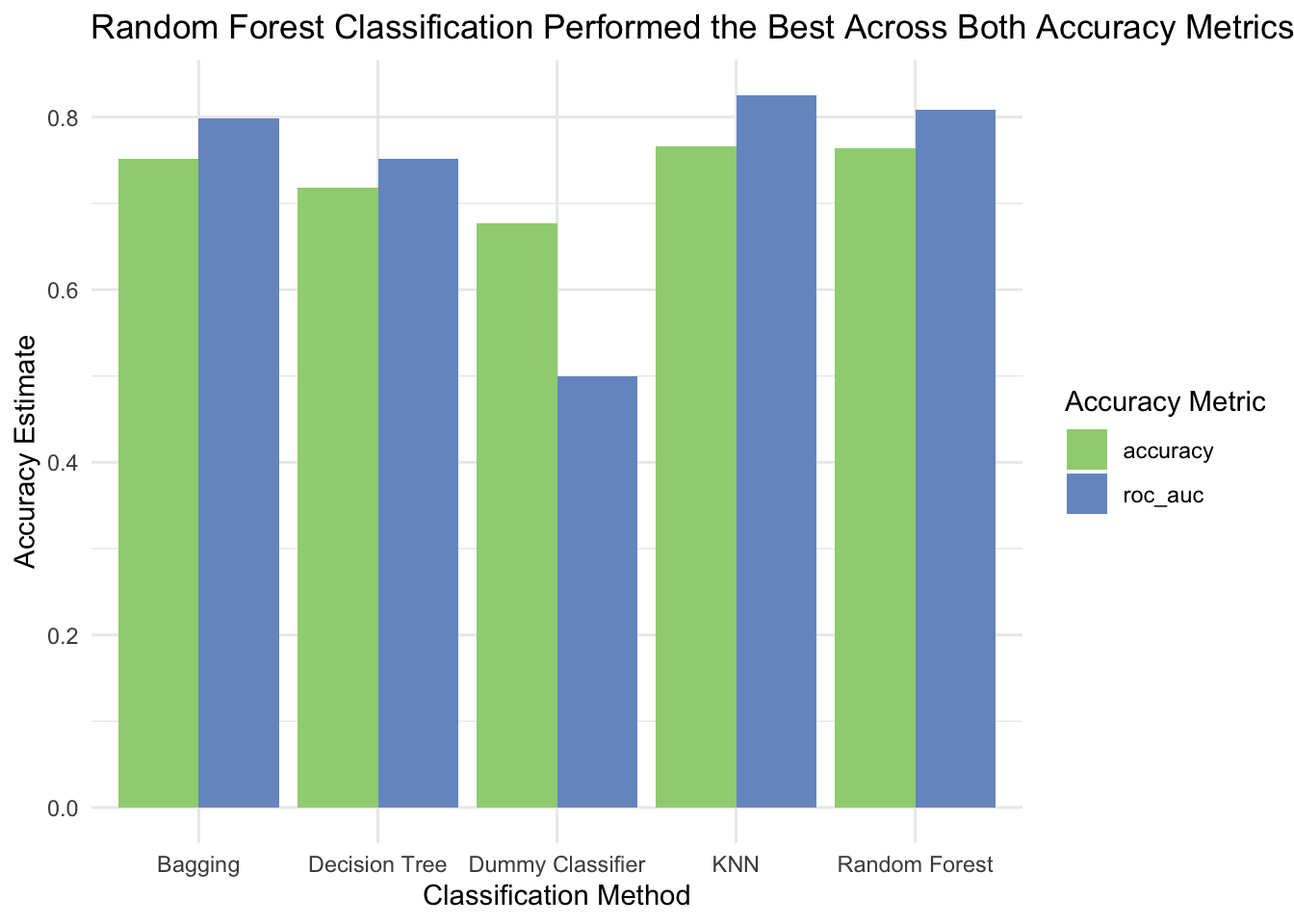
The below table and chart demonstrates how well the various models I used performed in terms of accuracy and ROC AUC scores.
#cleaning model metrics to create a table with each model's performance metrics

forest_results_table <- final_forest_fit %>% collect_metrics() %>%
  dplyr::select(.metric, .estimate) %>%
  mutate(method = "Random Forest")

bagging_results_table <- final_bag_fit %>% collect_metrics() %>%
  dplyr::select(.metric, .estimate) %>%
  mutate(method = "Bagging")

decision_tree_results_table <- final_tree_fit %>% collect_metrics() %>%
  dplyr::select(.metric, .estimate) %>%
  mutate(method = "Decision Tree")

knn_results_table <- final_fit %>% collect_metrics() %>%
  dplyr::select(.metric, .estimate) %>%
  mutate(method = "KNN")

majority_class_results_table <- data.frame (.metric  = c("accuracy", "roc_auc"),
                  .estimate = c(nrow(lewis_liked_tracks) / (nrow(lewis_liked_tracks) + nrow(elke_liked_tracks)), .5),
                  method = c("Dummy Classifier", "Dummy Classifier")
                  )

full_results <- bind_rows(majority_class_results_table,
                          knn_results_table,
                          decision_tree_results_table,
                          bagging_results_table,
                          forest_results_table) %>%
  dplyr::select(method, .estimate, .metric)

#table of results
full_results %>%
  kbl(caption = "Table 5. Classification Methods and their Respective Accuracies") %>%
kable_classic(full_width = T, html_font = "Cambria")| method | .estimate | .metric |
|---|---|---|
| Dummy Classifier | 0.6774194 | accuracy |
| Dummy Classifier | 0.5000000 | roc_auc |
| KNN | 0.7662651 | accuracy |
| KNN | 0.8254070 | roc_auc |
| Decision Tree | 0.7180723 | accuracy |
| Decision Tree | 0.7515946 | roc_auc |
| Bagging | 0.7518072 | accuracy |
| Bagging | 0.7981592 | roc_auc |
| Random Forest | 0.7638554 | accuracy |
| Random Forest | 0.8089996 | roc_auc |
#accuracy plot
ggplot(data = full_results, aes(x = method, y = .estimate, fill = .metric)) +
  geom_bar(stat='identity', position='dodge') +
  theme_minimal() +
  scale_fill_manual(values=c("#9fd182", "#7798c9")) +
  labs(y = "Accuracy Estimate",
       x = "Classification Method",
       fill = "Accuracy Metric",
       title = "Random Forest Classification Performed the Best Across Both Accuracy Metrics")
Thankfully, all of my machine learning models performed better than a dummy classifier (one that always predicts that a song is from my library).
Across both performance metrics, the simple decision tree performed the worst out of the models. I believe this is likely due to the class imbalance in the data. Decision trees are “greedy” learners, which means that they don’t think ahead when deciding how to split at any given node. When one class has low representation, observations can get lost in the majority class nodes and the prediction of the minority class will be even less likely than it should. Essentially, nodes for this decision tree were more likely to contain my songs because my music library is twice as large. For instances where Elke and I listen to similar music, the fact that I have more songs could influence the prediction of the model.
K-nearest neighbors is also sensitive to class imbalances, as predictions are based solely on the number of similar observations; however, my KNN model outperformed the decision tree model quite substantially with a higher accuracy and much higher ROC AUC.
The two ensemble algorithms, bagged decision trees and random forests, performed best on my test data. Random forests outperformed bagging across both accuracy and ROC AUC, making it the best performing model. Due to the class imbalance, it’s likely that many decision trees in the bagging ensemble were highly correlated, so utilizing the random forest approach to decorrelate each individual tree likely helped improve the model efficiency.
While all of the models performed better than a dummy classifier, none were truly exceptional in distinguishing Elke’s liked tracks from mine. When looking at the predictions for each model, I was able to see the percent confidence rate for each prediction—it looked like the models were highly confident when predicting some songs (mainly rap, hip-hop and R&B) from my library, but were much less confident when predicting the alternative/indie music that both Elke and I enjoy.
Overall, this project was a great opportunity to explore the world of music data analysis and machine learning. It was cool to see the patterns in our music libraries and to compare our tastes on a statistical level. While the results of our classification models were not perfect, they were still quite accurate, and they suggest that there are meaningful differences in the types of songs that Elke and I tend to listen to.
If you’re interested in conducting a similar analysis in R, I highly recommend checking out my github repository for this assignment, exploring the Spotify API, and experimenting with the various features and methods available. It’s a great way to gain insight into your own music tastes and to see how they compare to those of your friends and peers.
@online{white2023,
  author = {White, Lewis},
  title = {Whose {Song} Is It {Anyway?}},
  date = {2023-03-12},
  url = {https://lewis-r-white.github.io/posts/2023-03-13-spotify-ML-blog/},
  langid = {en}
}